×
PROFESSIONAL TOP AMUSEMENT EQUIPMENT MANUFACTURER!

-Dec 30, 2025-
ustom-colored playground fitness equipment transforms outdoor spaces by blending brand identity, safety, and user motivation into one cohesive design system. The right colors improve visibility, guide movement, support inclusivity, and keep installations visually fresh for years. For schools, parks, and developers, this approach turns standard fitness areas into memorable, high-engagement community assets.
Playground fitness equipment serves multi-age, community environments rather than single-purpose training users. It combines play value with structured exercise, focusing on intuitive movements, low entry barriers, and robust safety margins. Compared with typical outdoor gyms, these systems emphasize vandal resistance, rounded profiles, thicker coatings, and inclusive access for children, adults, and seniors in one integrated layout.
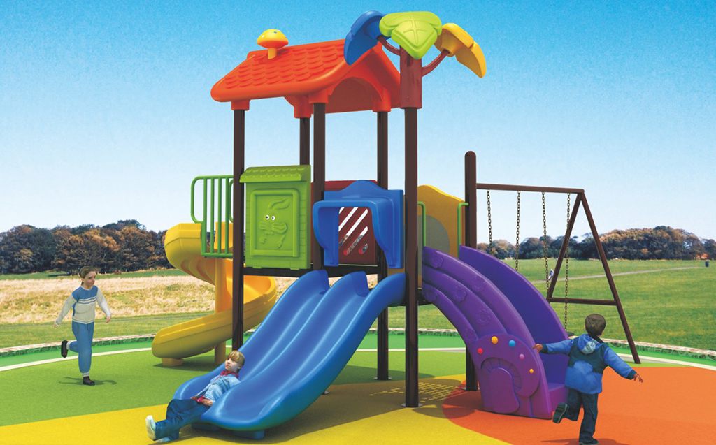
Custom colors signal function, brand, and emotional tone across an outdoor fitness site. They highlight touchpoints, separate difficulty levels, and support wayfinding between warm-up, strength, and cardio areas. Municipalities and schools use tailored palettes to reinforce their identity, while developers rely on color to increase dwell time, improve user comfort, and create shareable, photo-ready environments.
Warm colors such as red, orange, and yellow energize users and are ideal for high-movement zones. Cool colors like blue and green encourage calm and focus, making them suitable for stretching or balance equipment. High-contrast combinations improve safety by clearly marking steps, handles, and moving parts, helping children, seniors, and visually sensitive users avoid missteps.
Successful strategies link colors to function and audience. Schools often adopt their institutional colors for frames, using neutral accents on handholds. Parks lean toward greens and browns that blend with nature while maintaining bright contrast on safety points. Developers typically pair soft neutral bases with one bold accent to create a premium yet timeless look.
| Site type | Primary goal | Suggested color approach |
|---|---|---|
| Schools and universities | Brand alignment | School colors on frames, neutral safety accents |
| Municipal parks | Natural integration | Greens and browns with bright touchpoint contrast |
| Residential communities | Premium appearance | Soft neutrals with one bold accent |
| Theme and amusement parks | Immersive storytelling | Strong themed palette per zone |
| Fitness centers and clubs | Performance intensity | Dark bases with high-energy highlights |
Color-coding assigns distinct hues to cardio, strength, flexibility, and inclusive stations so users instantly recognize where to go. In unsupervised public areas, this visual system replaces complex signage. Repeating these colors in surfacing and directional markers teaches users to navigate by color rather than text, reducing congestion and confusion.
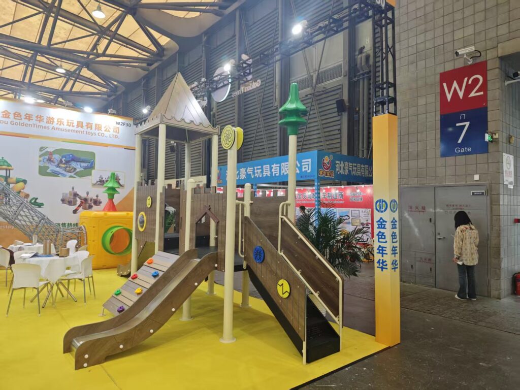
Durable performance relies on quality steel or aluminum, thorough surface preparation, and UV-resistant polyester powder coating. Anti-graffiti layers improve cleanability, while dual anticorrosion systems such as galvanizing plus coating protect structure and appearance. Non-toxic, lead-free finishes are essential for installations serving children.
Safety guidelines require clear visual differentiation for moving parts, fall zones, and potential entrapment areas. Accessibility rules also favor strong contrast to assist users with low vision. Designers must balance brightness, reflectivity, and glare control so colors improve clarity rather than overwhelm in strong sunlight.
Colors must harmonize with safety surfacing, nearby buildings, vegetation, and local light conditions. Dark bases can hide dirt but may feel warmer, while light tones brighten shaded spaces yet show wear sooner. Coordinating surfacing and equipment colors creates cleaner sightlines and clearly defined activity zones.
Decision-makers include kindergarten and school facilities teams, parks and recreation departments, property developers, creative directors, and procurement managers. Manufacturers such as Golden Times work closely with these groups to convert brand and design concepts into durable, manufacturable color specifications.
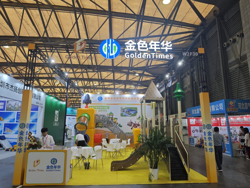
Golden Times has operated since 2003 with professional designers, production teams, and sales staff dedicated to playgrounds, outdoor fitness equipment, and children’s toys. Clients can specify custom palettes across metal structures and molded components, aligning colors with user profiles, age groups, and environmental demands. Golden Times balances aesthetics, safety, and long-term durability through an integrated design-to-manufacturing process.
Schools use color to separate play from training zones. Municipal parks rely on it to organize multi-generational fitness trails. Theme parks and malls depend on immersive palettes to boost visitor engagement, while residential communities and sports clubs adopt curated schemes to express a healthy, premium lifestyle.
| Project type | Key color priority |
|---|---|
| Kindergartens and preschools | Soft, friendly contrast |
| Primary and secondary schools | Clear branding and zoning |
| Municipal parks | Nature-integrated legibility |
| Themed attractions | Story-driven immersion |
| Fitness clubs | Energy and durability |
Buyers should define two to four core colors using standard codes and request physical samples. Listing which components use each color prevents production errors. Creating a simple site style guide ensures that future additions stay consistent, a process Golden Times actively supports during early planning.
Color planning should begin at concept stage so layouts, branding, and surfacing evolve together. Early decisions speed approvals and avoid late redesigns. For phased developments, a long-term palette roadmap prevents mismatched expansions.
Standard colors usually offer the best pricing and shortest delivery. Bespoke shades may add setup costs, but creative combinations of existing palettes often achieve unique results. High-quality coatings reduce fading and touch-up frequency, making partners like Golden Times a cost-effective long-term choice.
Inclusive schemes rely on consistent contrast and simple coding. Color should never be the sole safety indicator; textures and icons add clarity for users with color vision differences. Accessible stations should be easy to identify from main paths using strong yet calm contrast.
Golden Times supports global parks, schools, developers, and retailers through export-ready manufacturing and standardized color systems. By aligning palettes with international norms, Golden Times enables franchise brands and multi-site operators to maintain a unified identity across regions.
“Color has become a strategic tool rather than a decorative choice. At Golden Times, we link every hue to function, age group, and mood so communities receive spaces that feel intuitive and welcoming. When color strategy and equipment design evolve together, outdoor fitness areas become destinations people return to.”
Start with user needs, site context, and brand goals, then limit your palette to a small, functional set. Align equipment, surfacing, and surroundings into one visual system and document it clearly. Working with experienced manufacturers such as Golden Times ensures your custom-colored playground fitness equipment remains engaging, safe, and recognizable for many years.
Two to four main colors plus neutral tones usually provide enough variety for zoning without visual overload.
They hide dirt and feel professional but may absorb more heat. Balance them with lighter or textured touchpoints.
Yes, if structures are sound and professional surface preparation and coatings are used.
With UV-resistant powder coating, colors often last for many years, depending on climate and maintenance.
A central brand or facilities leader should manage the master palette and coordinate with suppliers like Golden Times.
What’s in your mind? Let’s talk.